Docs Build
Designing the card
Choose what a visitor sees when they open a location, lay it out block by block, and change it for one location only.
What the card is
#The card opens when a visitor clicks a pin or a results row: the location’s name, address, photos, hours and buttons, laid out as you like.
One design covers your whole account — every location on every map. Any single location can still differ; see Changing one location’s card.
Finding your way around
#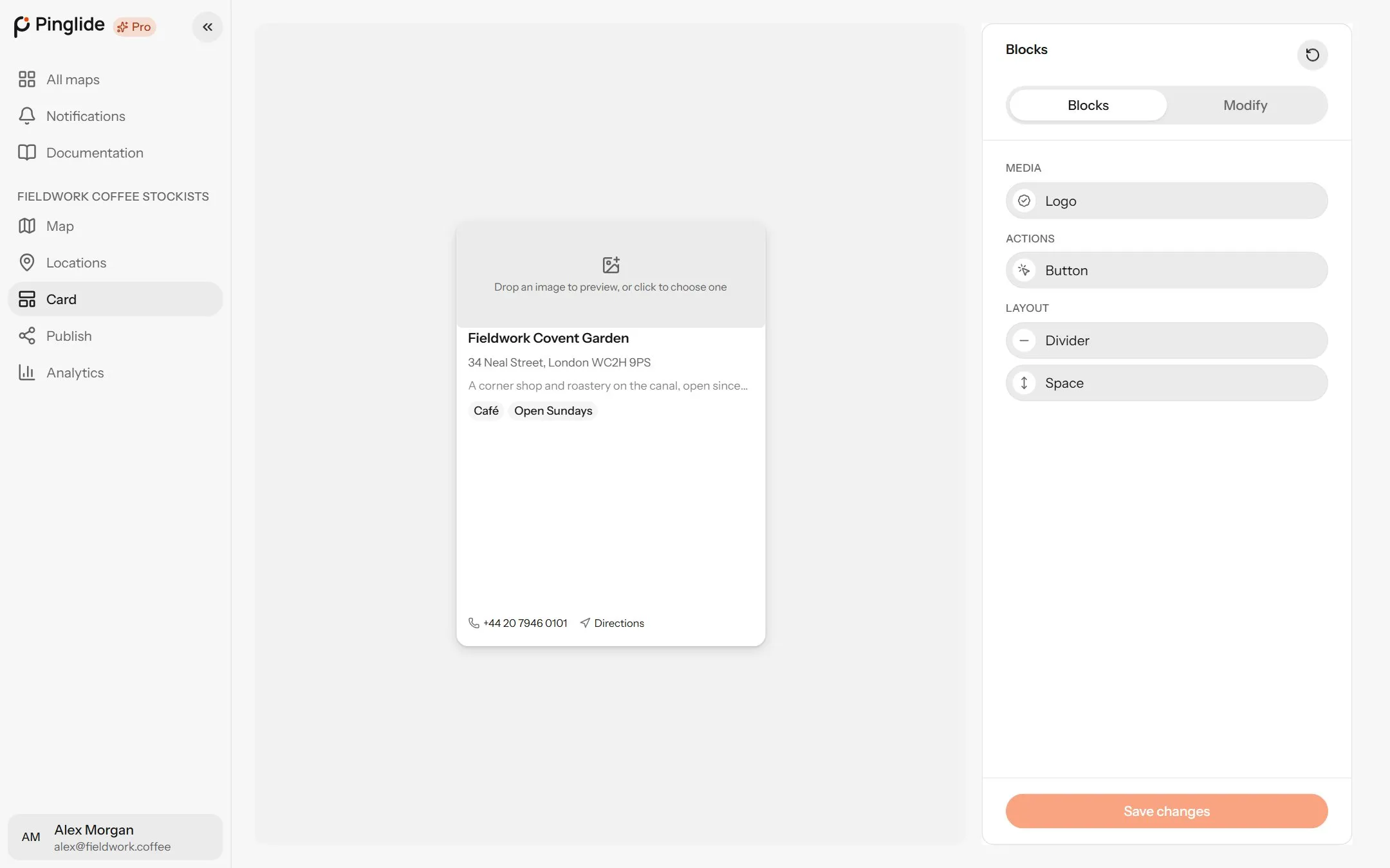
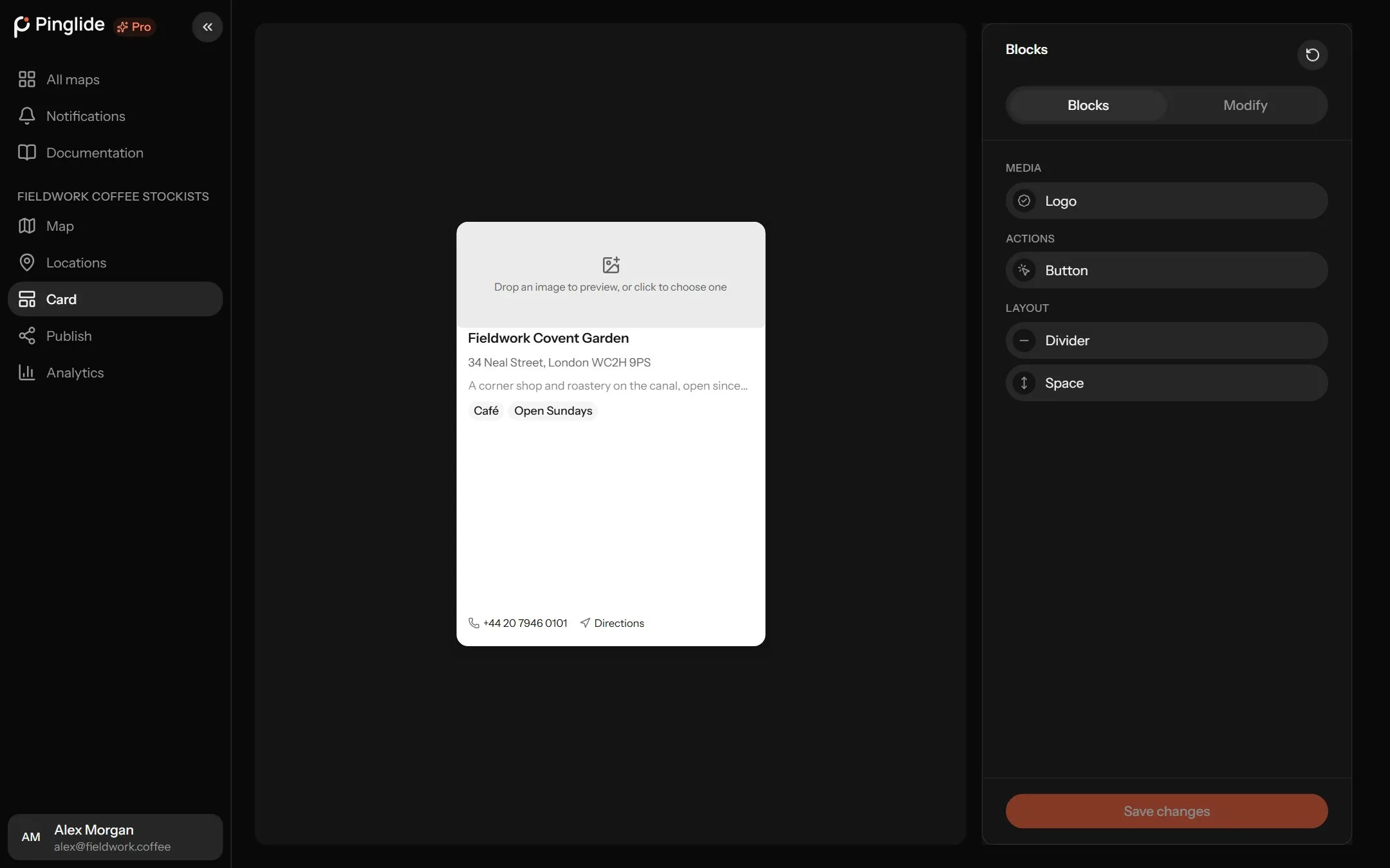
Open Card in your map’s sidebar. The card is drawn with one of your locations (or an example), beside a panel with two tabs:
- Blocks — the pieces a card is built from, and Save changes at the foot.
- Modify — settings for the selected block, or the card when nothing is selected.
A dot on Blocks means unsaved changes. Reset card starts again from an empty card.
The blocks
#| Block | What it shows | Can go |
|---|---|---|
| Name | The location’s name. | Top or middle |
| Address | Its stored address. | Top or middle |
| Description | Its description. | Middle |
| Tags | Its tags, as coloured chips. | Top or middle |
| Opening hours | The week, with Open now or Closed now. | Middle or bottom |
| Photos | Its photos, with arrows between them. | Anywhere |
| Logo | Its own logo, or its pin. | Anywhere |
| Links | Phone, email, website and directions. | Bottom |
| Button | Directions, the website, or one of your extra fields. | Middle or bottom |
| Divider | A line. | Anywhere |
| Space | A gap. | Anywhere |
Button, Divider and Space can repeat; every other block is used once.
Adding, moving and removing blocks
#Add
Drag a block from Blocks onto the card, or click it and then a highlighted spot.
Move and resize
Drag a block to move it, and its Height or Size handle (or arrow keys) to resize it.
Remove
Drag it to the Remove wall beside the card.
A block that won’t drop means the card is full: make it taller under Size, or remove something.
The card itself
#| Section | Settings |
|---|---|
| Size | Width and Height, from XS to XL. |
| Spacing | Padding, and the Gap between blocks. |
| Style | Corners, Shadow, Background, Transparency, Blur behind, Border and Border width. |
A block’s settings
#| Section | Settings |
|---|---|
| Size & position | Position (Top, Middle or Bottom), Height, Width, Alignment, and whether it Overlaps the photo. |
| Spacing | Margin and Padding. |
| Text | Font, Size, Colour and Bold. |
| Chips | For Tags: Chip colour, Chip border, Border width and Chip padding. |
| Button style | Style (Solid, Soft, Outline, Ghost or Pill), Colour, Border colour, Border width, Corners, Inner padding, Hover and Full width. |
| Content | What the block shows. Different for each block — see below. |
| Block | Content settings |
|---|---|
| Button | Action — Directions or Link. Link to picks the Website or an extra field. Label is its text. |
| Links | Show — which of Phone, Email, Website and Directions appear. |
| Logo | Show — Pin, Mixed (the pin where there’s no logo) or Logo. Corners — Square, Rounded or Round. |
| Description | Show it in full, or cut it to a number of Lines. |
| Opening hours | Week — Bold, Whole week, Full day names — and Space between days. |
A button with no Colour follows each location’s pin colour, and so does a Logo block drawing the pin, including a colour set by a colour column in an imported file. For a per-location button link, add an extra field of type Link, then pick it under Link to. Preview settings only change the example you design with.
Changing one location’s card
#A flagship store might want a different button or a larger photo:
Open its card on the map
On the Map tab, click the location’s pin.
Press Edit this card
It’s in the card’s top-left corner.
Click a block and change it
The designer’s settings open, and save by themselves. A Button can also use A link I’ll type, for this location only.
Press Done
Reset to card design takes the block back to the account’s design.
A location can change how a block looks and what it says, but not which blocks the card has or their order.